BC 24/25
Ballet
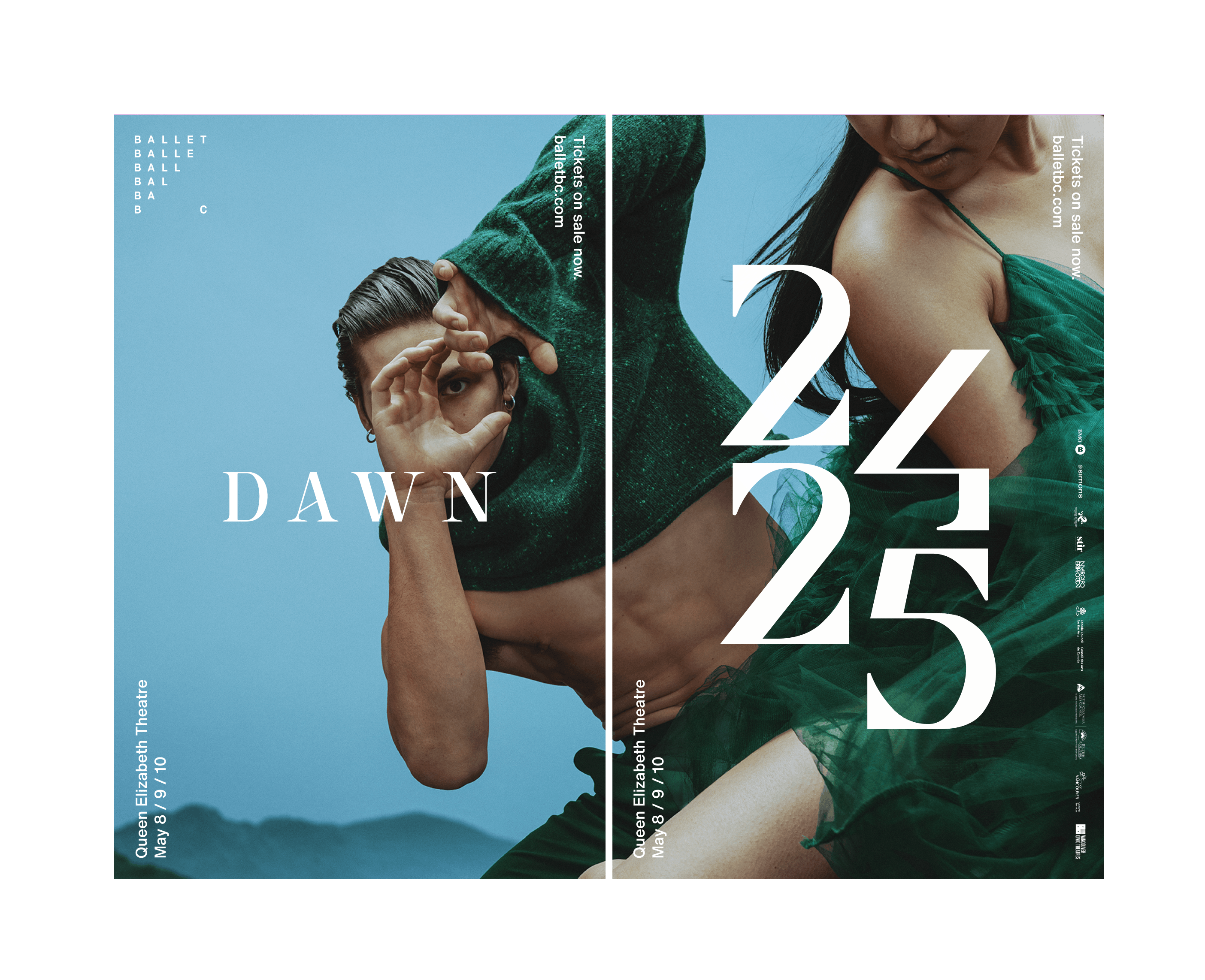
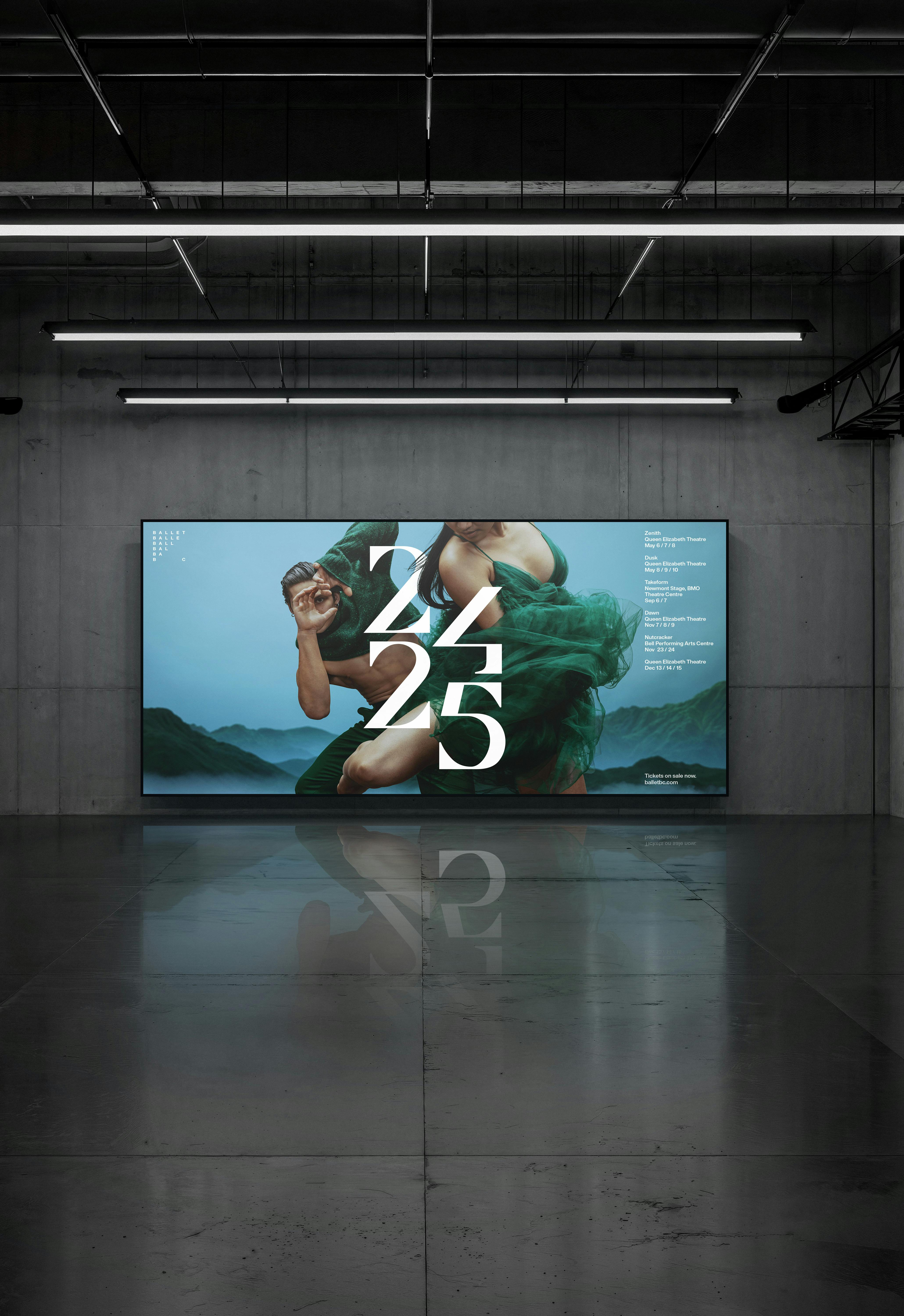
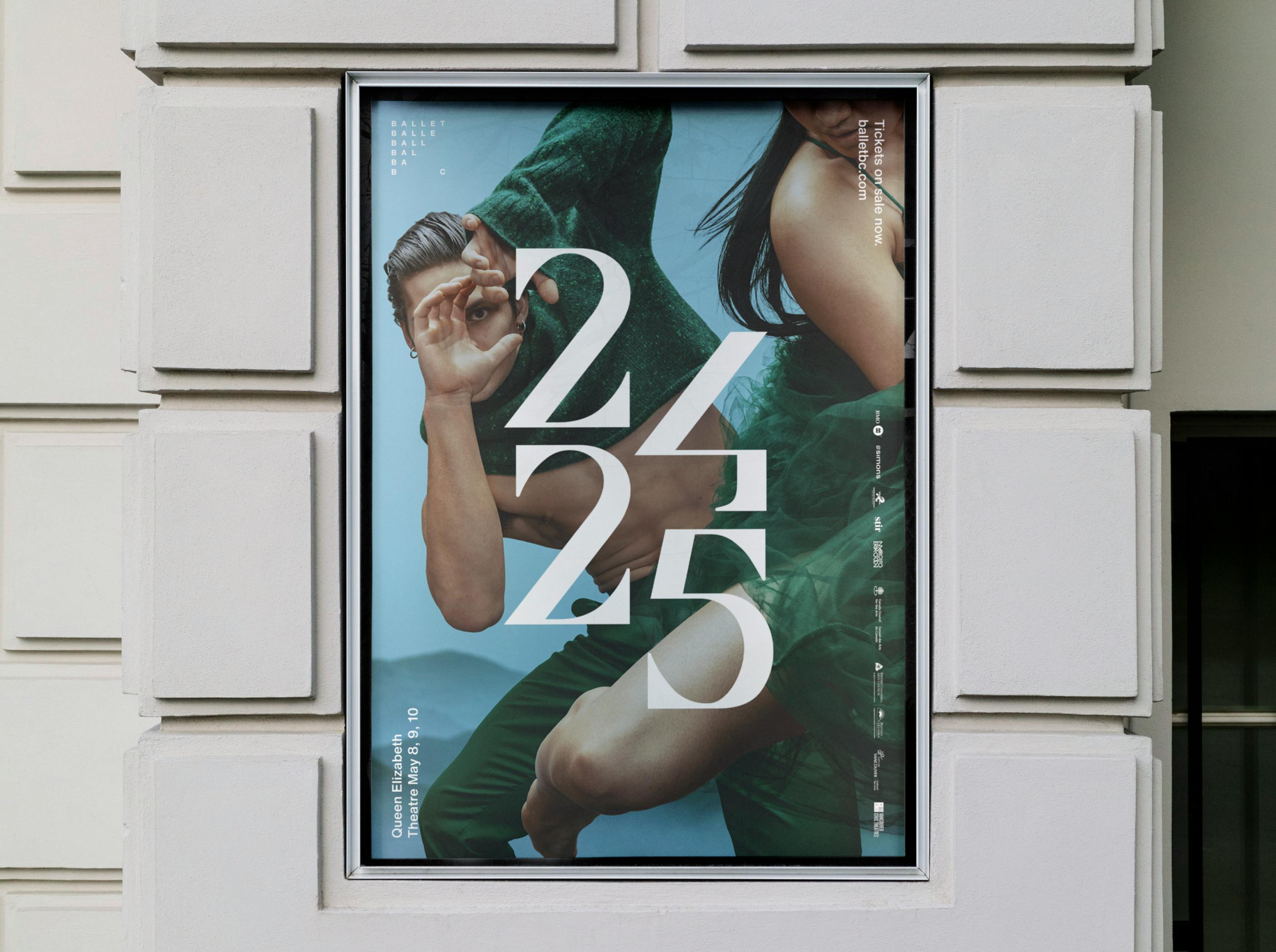
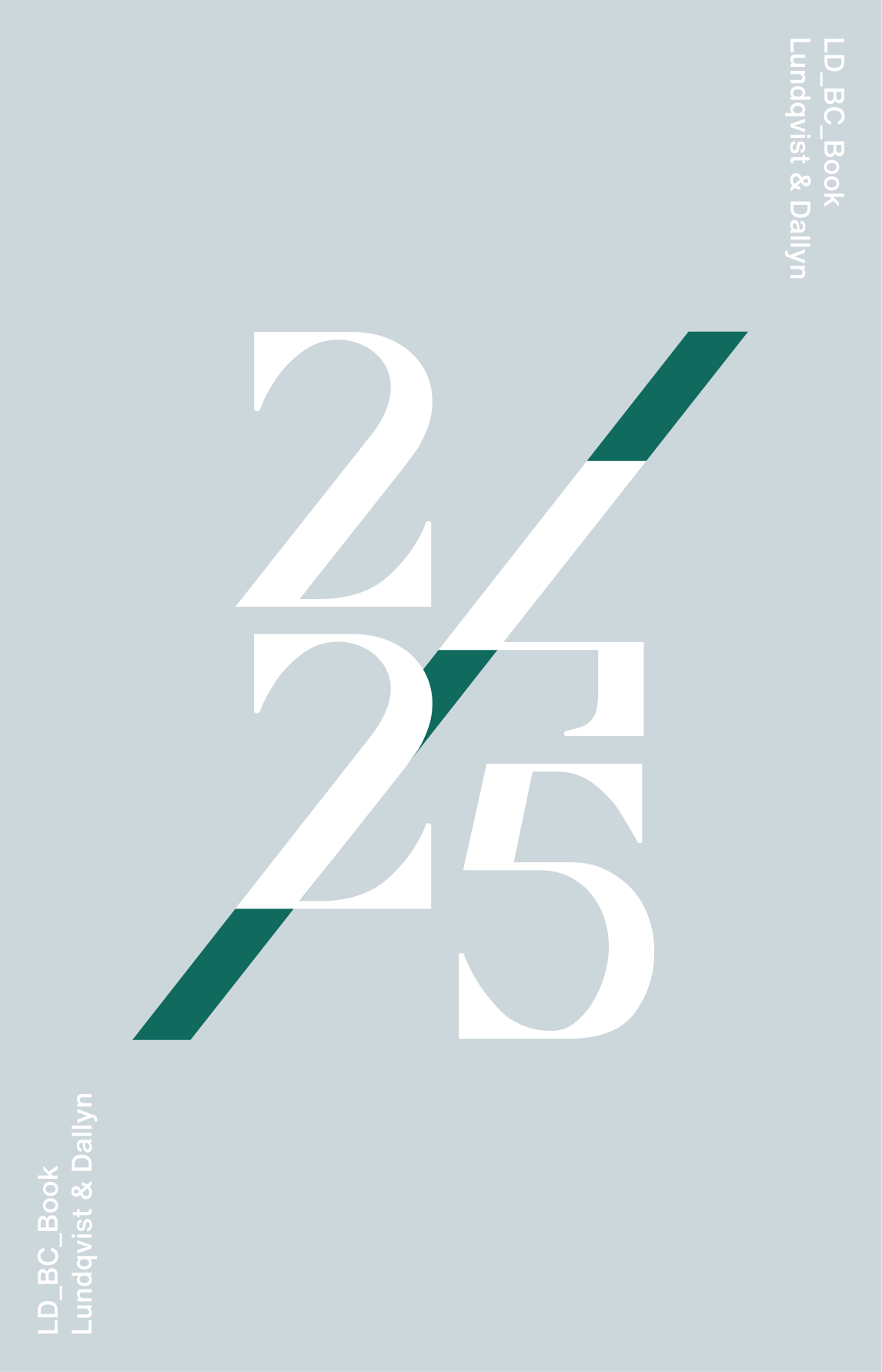
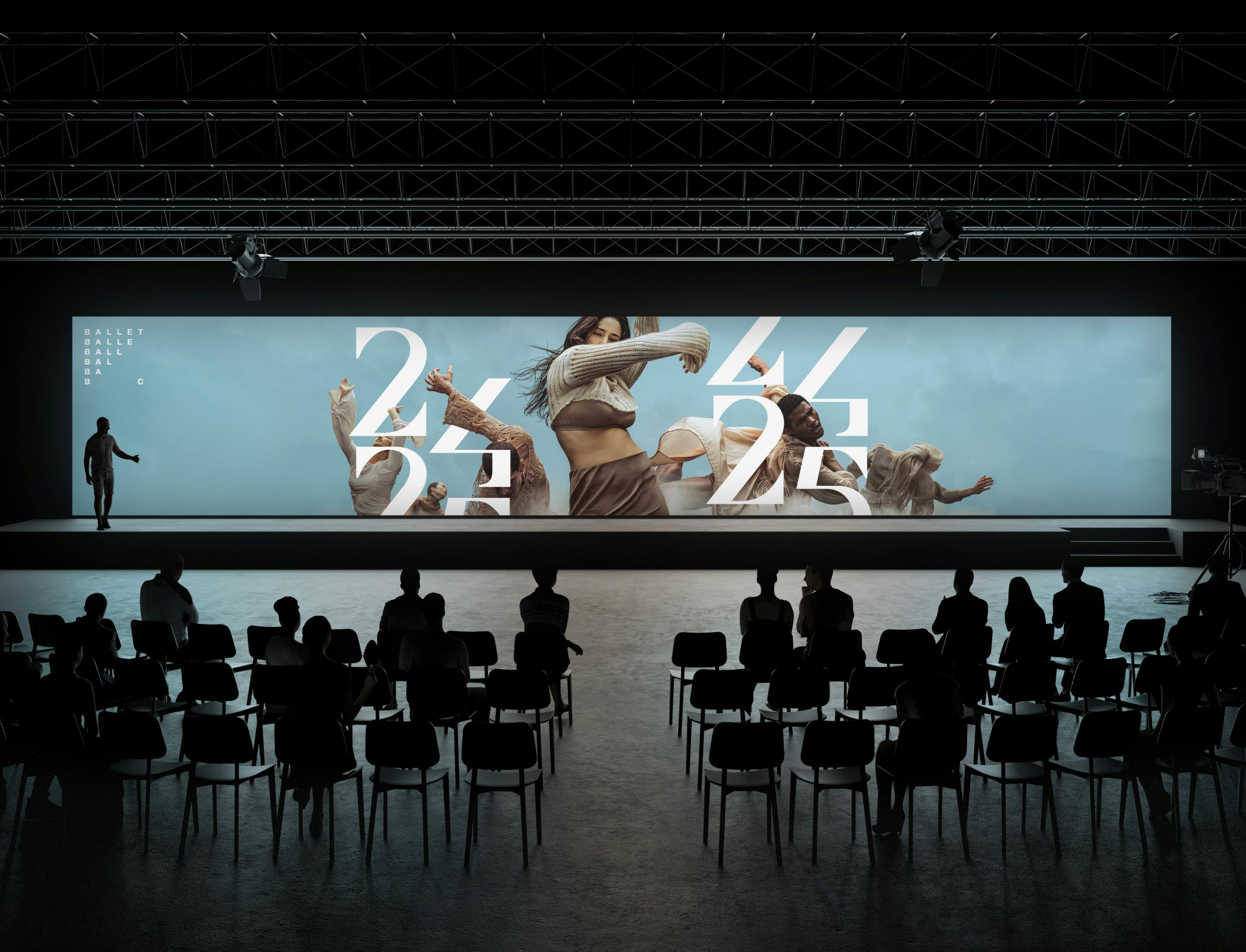
We designed a custom typeface for Ballet BC for the start of the 2024/25 season. The design features twenty-four and twenty-five stacked numbers, giving it a classical feel with a modern twist, where the arrangement of the numbers creates a slash.
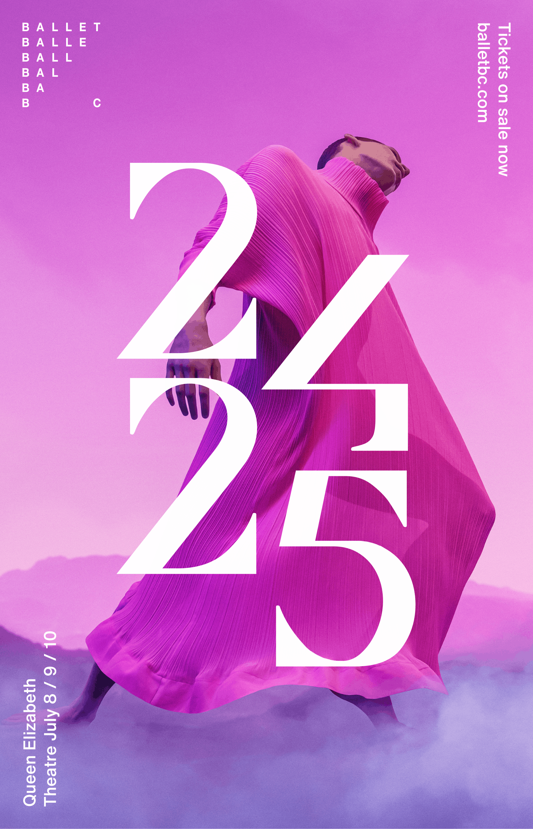
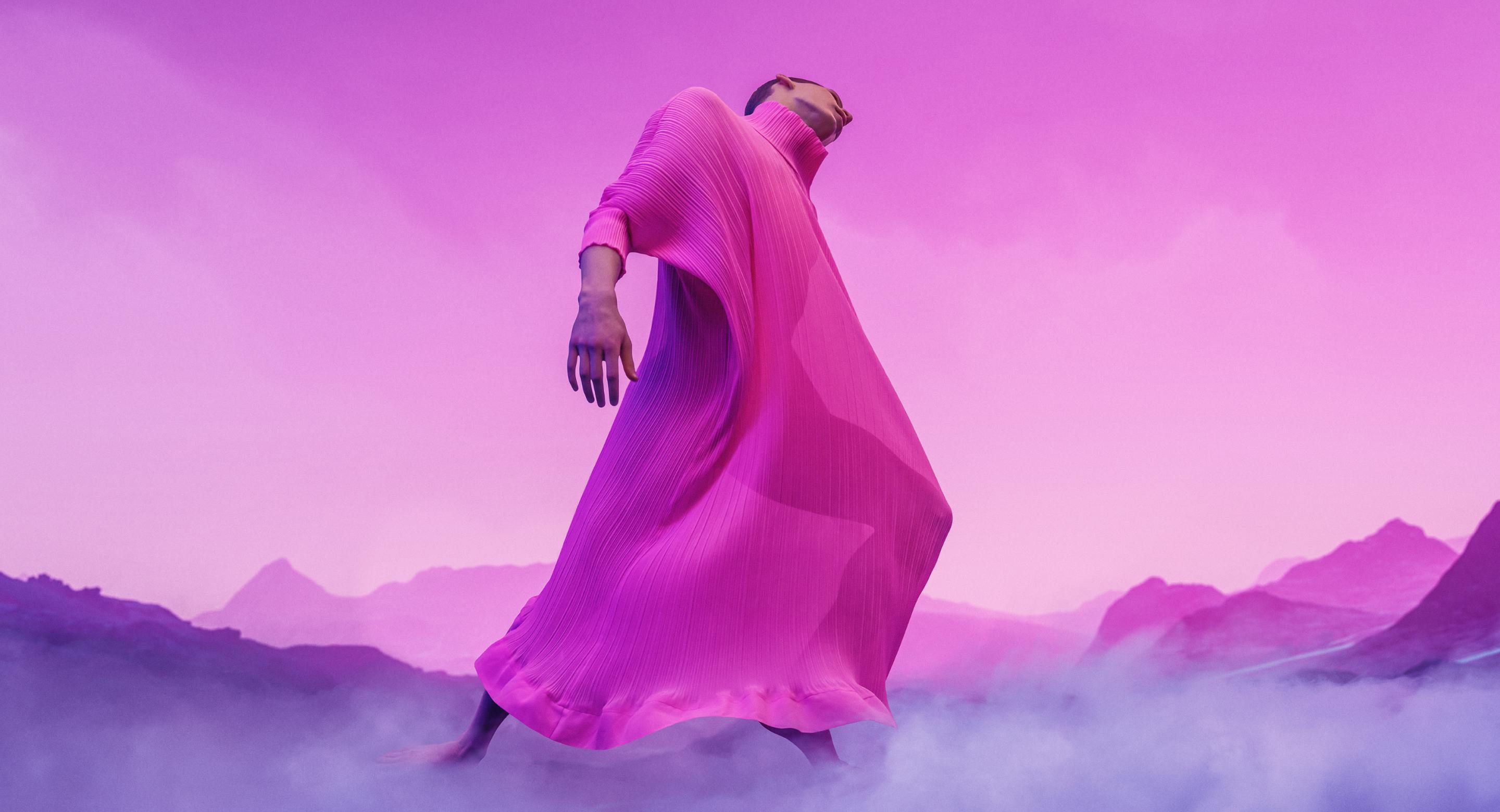
This bespoke typeface is thoughtfully crafted to align with the elegant aesthetic that Ballet BC embodies. It beautifully complements the stunning panoramic images that showcase each ballet performance, enhancing the visual experience. Each character is designed to resonate with the artistry and grace of ballet, making it a perfect fit for the company’s branding as they embark on a new season filled with captivating performances.
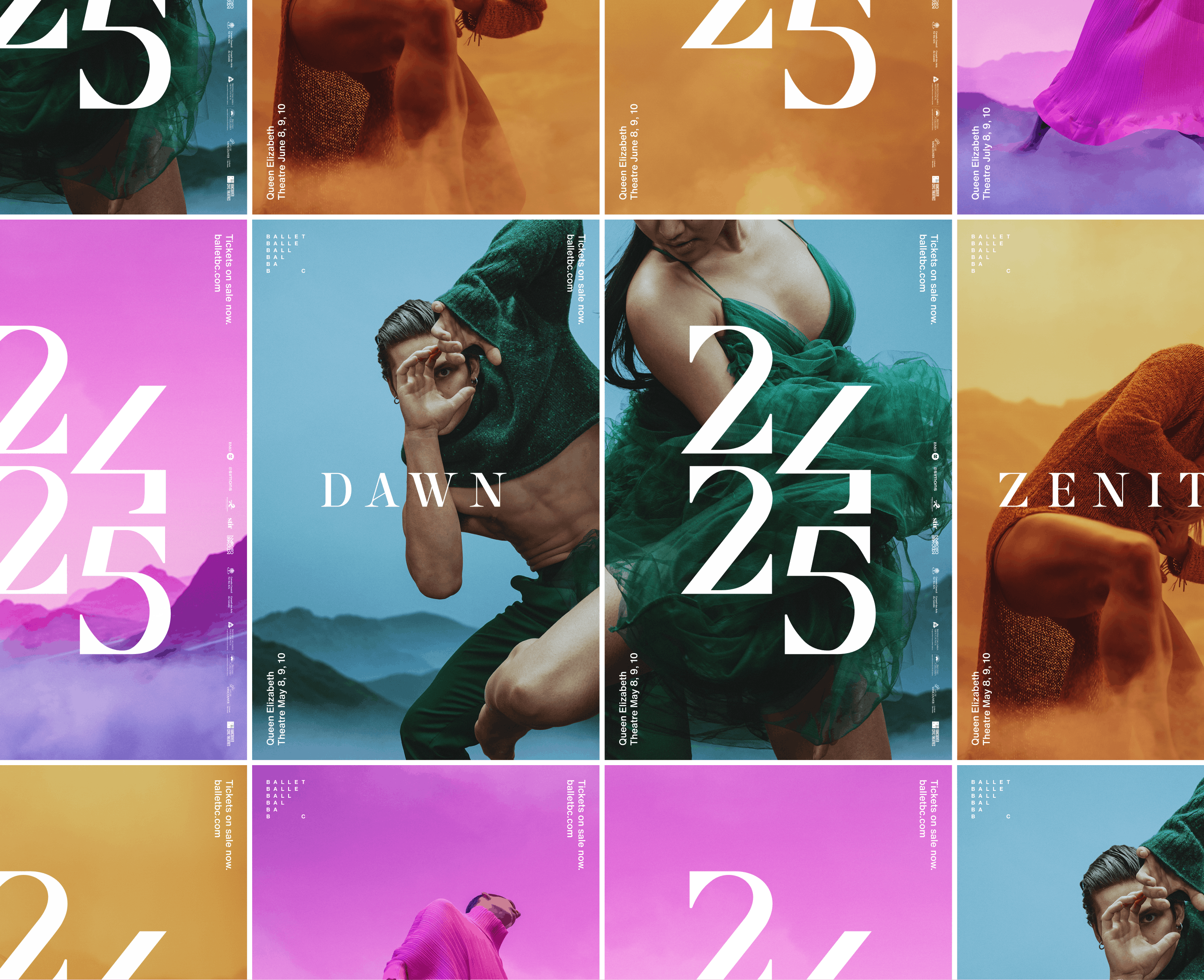
The animation amplifies the slash implied by the number of shapes.

Next Project
Aston Labs
